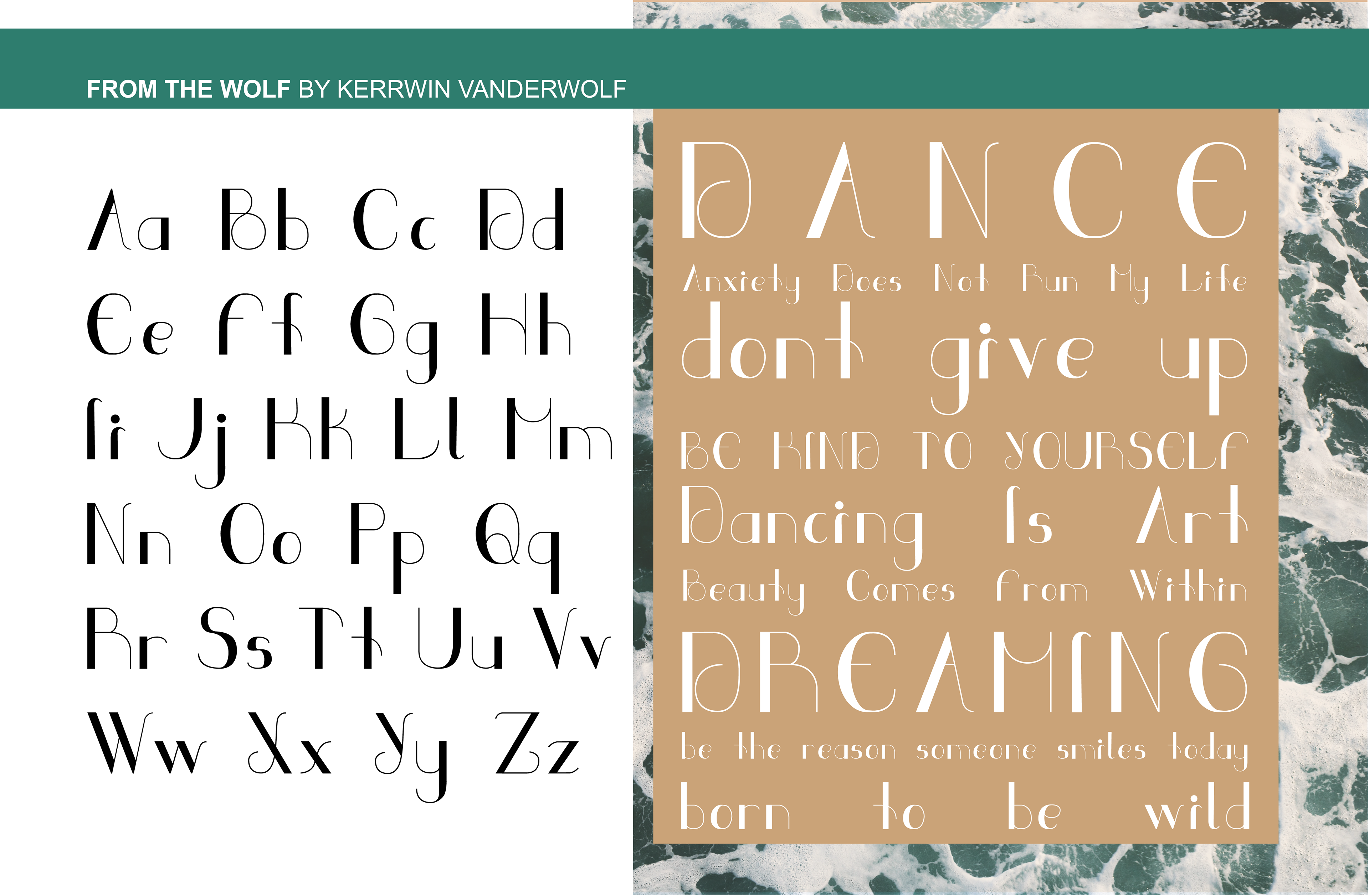
The design process began with the capital “B,” which established the foundation for the typeface’s visual language. Many of the letterforms borrow curvatures from related characters to create a harmonious and consistent flow across the set. Certain letters, such as the lowercase “p” and “q,” were designed as reflective counterparts, reinforcing balance and cohesion.
From the Wolf is a personal project inspired by my experiences with anxiety, channelling those challenges into a visual expression of resilience. The letterforms embody strength through their distinctive stroke contrast, with thicker strokes on the left and thinner strokes on the right, creating a sense of grounded stability paired with delicate movement. The curvature draws inspiration from organic forms found in nature, celebrating its innate beauty while evoking both fluidity and structure.
March 2021